

What Your Logo’s Color Says About Your Company
Logo’s color plays an integral part in the recognition of brands. Think of Pepsi and Coke, for example—two massive competitors in the soft-drinks market. One uses blue; the other, red.
This significant difference of a logo’s color helps the consumer distinguish between the two. If both used the same color, consumers would have a much harder time identifying the one they were looking for on the shelves of their local supermarket—they’d have to look even harder at the packaging. The fact that you can tell the difference between bottles of Coke and bottles of Pepsi from a distance, even without being able to identify the logo, shows just how important color is to brand identity. I explain how to make the best color choices and ensure that the colors you chooseremain consistent across all media.
Color Psychology
Research has shown that color has a direct effect on our behavior and moods. Color can alter the
choices we make and the products we buy. An effective brand color or palette is one that
effectively supports the brand image while making a connection with the target audience.
Black
![]()
Black is the most powerful color in the spectrum. It exudes luxury but also can symbolize death
and misery. Guinness, brewer of the popular Irish stout, uses black as its main brand color to
reflect the color of the product.
White
![]()
White signifies cleanliness and purity, explaining why it’s the uniform color of doctors and nurses.
and it’s also is used heavily in interior design—it’s a neutral and light color that can make small
areas look larger than they are due to the amount of light that it reflects. White also is seen as a
color of luxury. Apple uses white in the design of its products and packaging to create a stylish and
luxurious brand image.
Red
![]()
Red is the color that affects people the most—it intensifies our emotions on many different levels,
at both ends of the spectrum. It’s the color of love and romance, as well as anger (think of people
getting red in the face with rage).
Orange
![]()
Orange is the most exciting color in the spectrum. It radiates warmth and energy. Orange is
strongly associated with positivity and a new dawn, which is why the telecommunications
company of the same name use the color for its brand name, color, and slogan (“The future’s
bright, the future’s orange”).
Yellow
![]()
Yellow is the hardest color for the human eye to process because of its intensely bright hue.
It should be used sparingly, not over vast areas. When used in context, yellow can be a
cheerful and happy color, perhaps because of its connection to the color of the sun. McDonald’s
take advantage of this relationship by using the color yellow for its Golden Arches.
Green
![]()
Green is the most dominant color in nature. It’s relaxing and reassuring, making it the perfect
choice for businesses claiming to be eco-friendly. You’ll notice that green is used on the packaging
of healthy foods, to try to influence consumers’ shopping habits. Subway is one multinational
company using green to great effect; by using green on its storefronts, menus, and packaging,
Subway has played a major role in convincing consumers that it’s the healthy fast-food alternative
to McDonald’s and KFC.
Have you ever heard your favorite late-night talk-show host refer to celebrities waiting in the
“green room”? Those rooms have been painted green to try to calm guests’ nerves before walking
out onstage.
Blue
![]()
Blue is the most common corporate color because it’s viewed as the least threatening and most
trusting color. This explains why large financial institutions such as Barclaycard use blue as their
main brand color. Ford uses it to help convince potential buyers that its cars are reliable, which is
even more important when the product is expensive.
Purple
![]()
Purple is traditionally associated with royalty and luxury. It’s said to help increase our creativity.
One company that famously uses the color purple is Cadbury, the confectionary company based in
Birmingham, England. Cadbury uses the color purple to create a luxurious perception of the
chocolate it sells. Cadbury has even copyrighted the use of the Pantone 2685C or “Cadbury
Purple,” as it’s commonly known, to help protect the brand’s identity.
Brown
![]()
Brown signifies the earth, the outdoors, and comfort. It also can be linked with reliability, which
could be why UPS uses brown in its logo, on its trucks, in employee uniforms, and on its
packaging. Brown also can be seen as dull and boring due to its lifeless pigment.
logo’s color Palette
The colors you choose may be affected by many factors, including the following:
• The characteristics of the target audience: You don’t have to adhere to traditional
stereotypical tastes, but keep in mind that some colors won’t be appealing to some audiences.
For example, bright colors aren’t suitable for the identity of a funeral parlor because they
conflict with the sensitive brand image.
• Any specifications in the brief relating to colors to be used or avoided: Your client may be
adamant that they definitely do or do not want to use a certain color or colors.
• The colors used by the client’s competitors: In some markets, a brand can be so powerful
that a color is often directly associated with a brand name, so using the same color would not be
ideal to achieve true distinction.
• Where the logo will be used: In some cases, the environment and surroundings of where the
logo will be applied or viewed could restrict or dictate the colors that can be used.
How many colors?
Designers often debate the number of colors that should be used in a logo. Years ago, the use of more than three colors in a logo was extremely expensive to reproduce in print.
Luckily, print technology has improved a great deal in the last decade or more, allow designers more freedom than they previously had. But, even though technology has advanced, the more colors you use, the more expensive it will be—especially if you’re printing solely using Pantone colors. Because they’re on opposite sides of the color wheel, complementary colors are those that have the highest contrast between one another, creating an increased level of vibrancy, See figure

A complementary color scheme in use. The blue shade is opposite the tan color on the
color wheel.
Monochromatic
Selecting one hue as the basis for a scheme, with varied intensities and shades of that hue, is a
monochromatic palette (see Figure).

Monochromatic schemes are easy on the eye because of the lack of contrast, but if they aren’t
handled correctly, they can look flat and have a reduced impact (see Figure).
![]()
RGB vs. CMYK, Screen vs. Print
You can never guarantee that a logo will be used for only one specific medium, whether that’s
screen or print. Even organizations that operate solely online will, at some point, have to send out
collateral that features their logo. Unfortunately, the biggest headache for designers is when a
logo’s color is not output using the same method on-screen or in print. Screen and print use different
color models.
The colors you see on-screen are formulated by the colors red, green, and blue (RGB). To make
things even more confusing, there are different methods of using inks in print. The most common is
the four-color process that is composed of cyan, magenta, yellow, and black (CMYK).
Figure 10-11 shows how both the RGB color models are created. Colors that you’re able to see
are created by the presence of light. Turn off your monitor, and you’ll notice that the screen is
black, be cause the monitor is not emitting any light. The presence of light forms the colors, which
means that RGB is additive. In print, the colors are created via light that is reflected rather than
emitted. By printing inks onto a material, it masks the reflection of light caused by the original
color of the material (which isn’t always white). The absence of ink will be the color of the
material—thus, CMYK is subtractive.
CMYK is effective, but you can never guarantee that each printer will use the same values of cyan,
magenta, yellow, and black inks to achieve the exact same output. An alternative is to use Pantone
colors, which offer a greater level of consistency, because they’re preformulated inks that are used
by printers internationally.
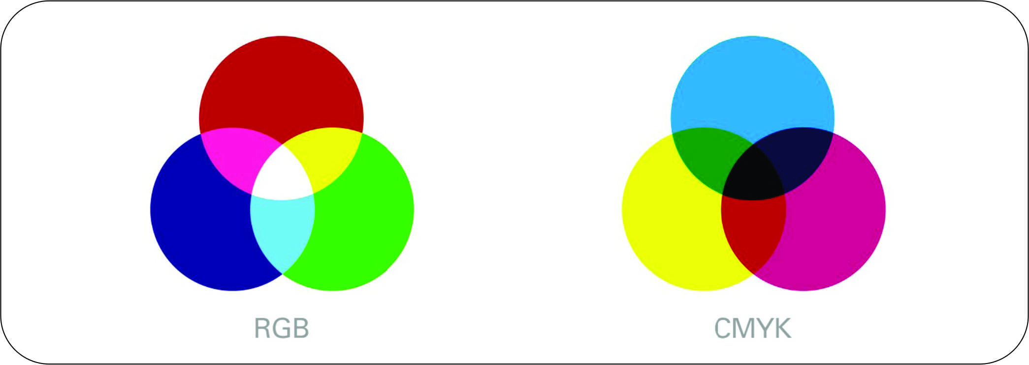
How the RGB and CMYK color modes are achieved.
One of the most valuable investments that a designer can make is the purchase of a Pantone Color
Book (available from www.pantone.com). The swatch book shows the true representation for
how the colors will print when using Pantone inks. The different swatch formula guides can even
show which color to select depending on the finish of the material you’re printing on. It will tell
you whether the Pantone ink is achievable in both CMYK and RGB, which can save you time.
Your vector-based software can display a vast selection of different color swatch libraries, both
in CMYK and in RGB. Some logo’s color in RGB won’t be achievable in CMYK, so you need to check
that your choice is achievable in both. If you don’t have a Pantone Color Book, you can do this by
selecting a color in RGB color mode and changing to CMYK color mode for your logo’s color. If a change occurs
(which it most likely will), then you’ll have to make some slight adjustments so that the difference
in color is not as noticeable. Using the Pantone Matching System (PMS) via the Pantone Color
Book is the most accurate and easiest way to check the output and versatility of your color
choices.
I find it easiest to start in the CMYK color mode and work backward, because I know that when
the document is converted to RGB there will be less of a difference. Also, if you already have the
value for an achievable color in CMYK, you can easily obtain the RGB values and web hex code
by double-clicking on the swatch in Adobe Illustrator. Most designers start with Pantones and then
find the CMYK values, followed by RGB.
A designer can never learn enough about printing methods. If you’re lucky enough to be offered a
tour around a printing press, take it—it can only increase your level of understanding
Leave a Comment